Editorial · Print · Art Direction · Writing · Photography
CULTŪRA
A magazine about how culture moves — and what it does to us.
CULTŪRA is a print-ready cultural magazine I conceived, designed, art directed, wrote, and illustrated in full. Every element — from the interviews to the image composites to the grid — was made by me, in service of a single question: who is shaping whom?
The five features explore contemporary trends in pop culture, media, and identity: the performance of self online, BookTok as a new literary gatekeeper, the pull of nostalgia on screen, what happens when the characters we grew up with get older, and the shift toward expressive heritage branding. Four of the articles grew from original interviews — with academics, a former literary agent, and a brand designer.
The intended reader is culturally curious, aged 18–35, and takes media seriously. The design problem was how to be visually rigorous without feeling cold or academic. The answer was to root everything in something warm and human — classical painting, natural imagery, hand-made art — while keeping the writing accessible and direct.
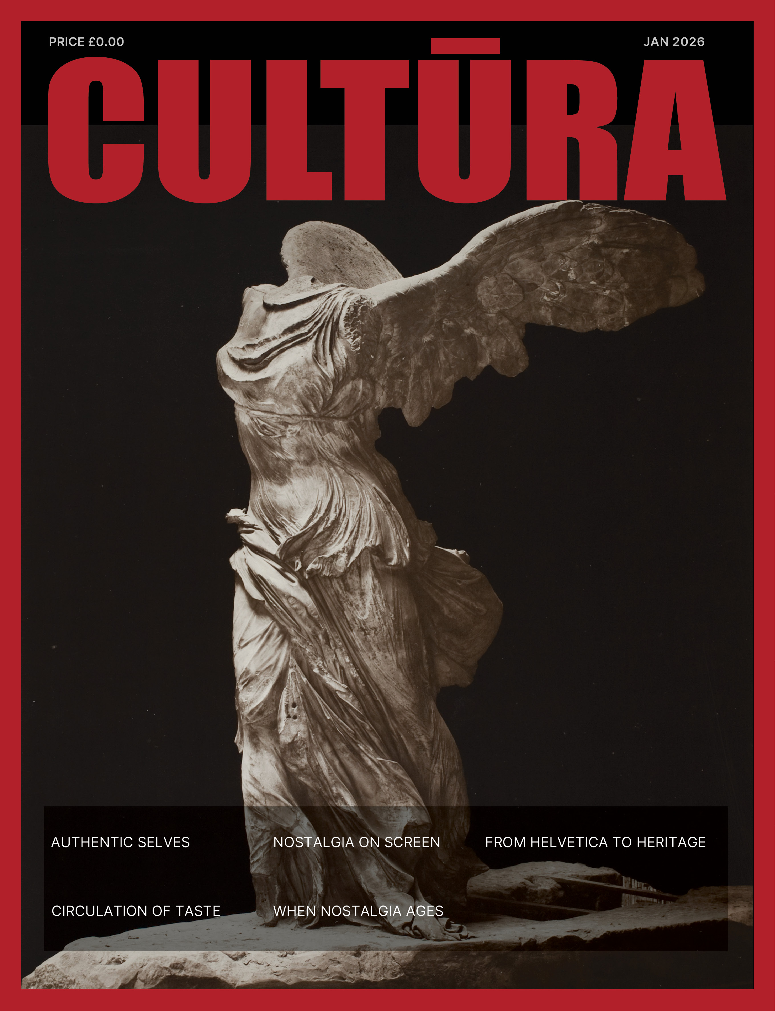
Cover — The Winged Victory of Samothrace. Logotype in Impact, red on near-black.
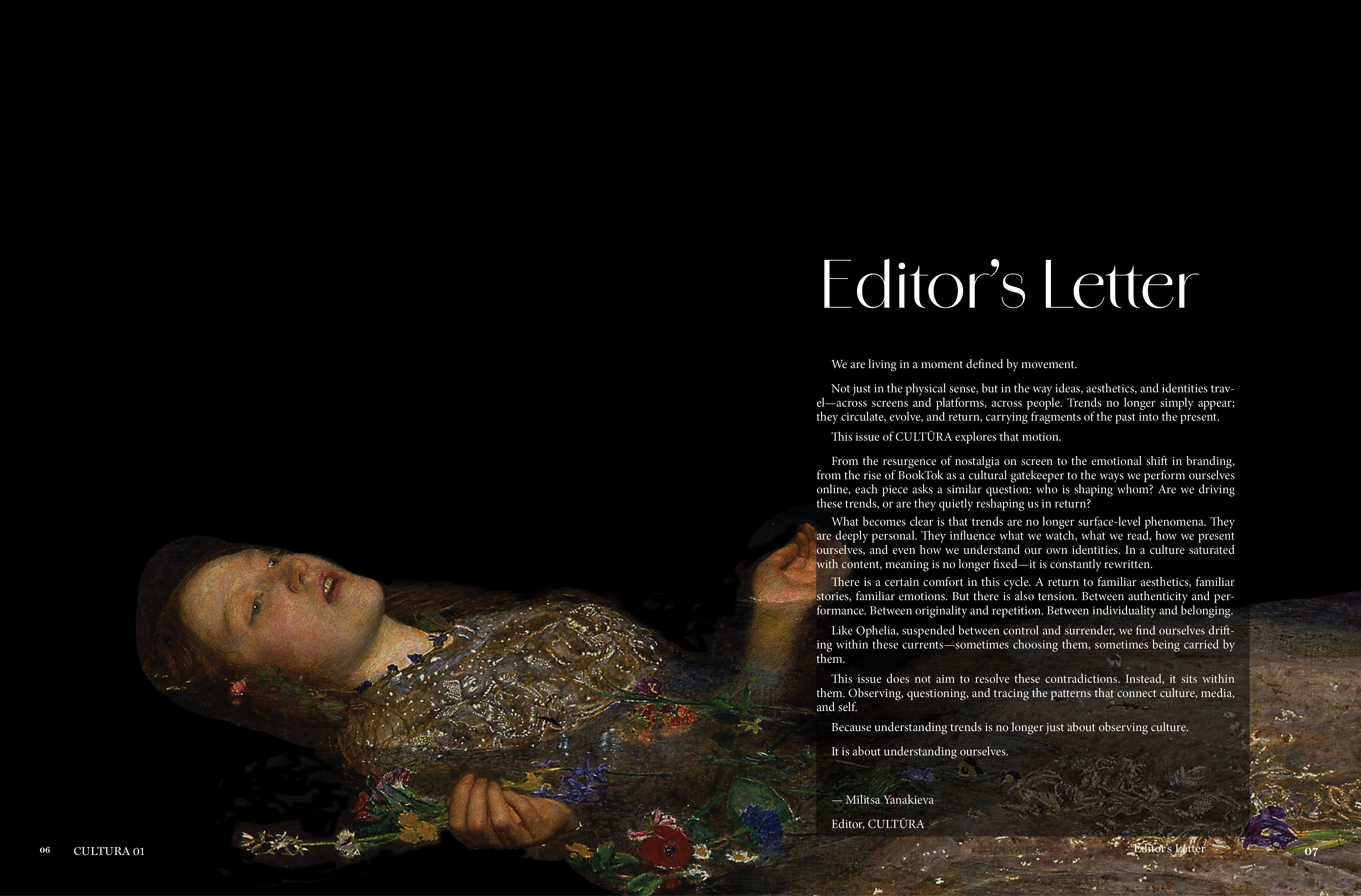
Editor's letter — Millais' Ophelia (1851–52), tonal treatment informed by Caravaggio
Ophelia as the issue's guiding image.
The editor's letter uses Millais' Ophelia as its central image — suspended between control and surrender, shaped by forces larger than herself. It is the right metaphor for a magazine about how we are all, to some degree, carried by trends, algorithms, platforms, and collective aesthetics we did not choose but cannot step outside of.
The tonal treatment was informed by Caravaggio: shadows deepened, contrast heightened, so that Ophelia's face and hands emerge from near-darkness. Both Millais and Caravaggio work with figures caught at a threshold — between life and death, agency and surrender — and that layered reference reinforces the issue's central argument: that we are always shaped by forces larger than ourselves.
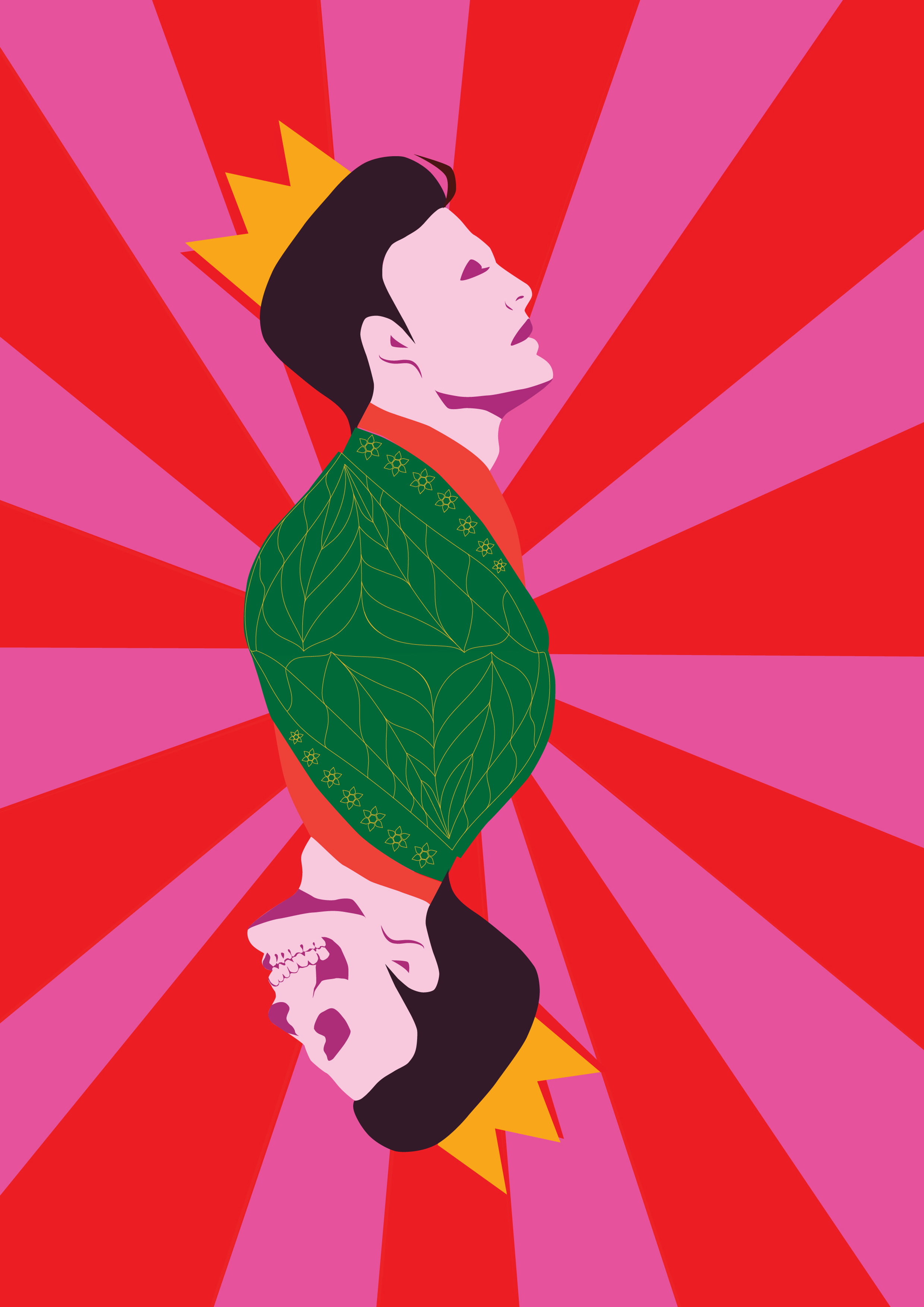
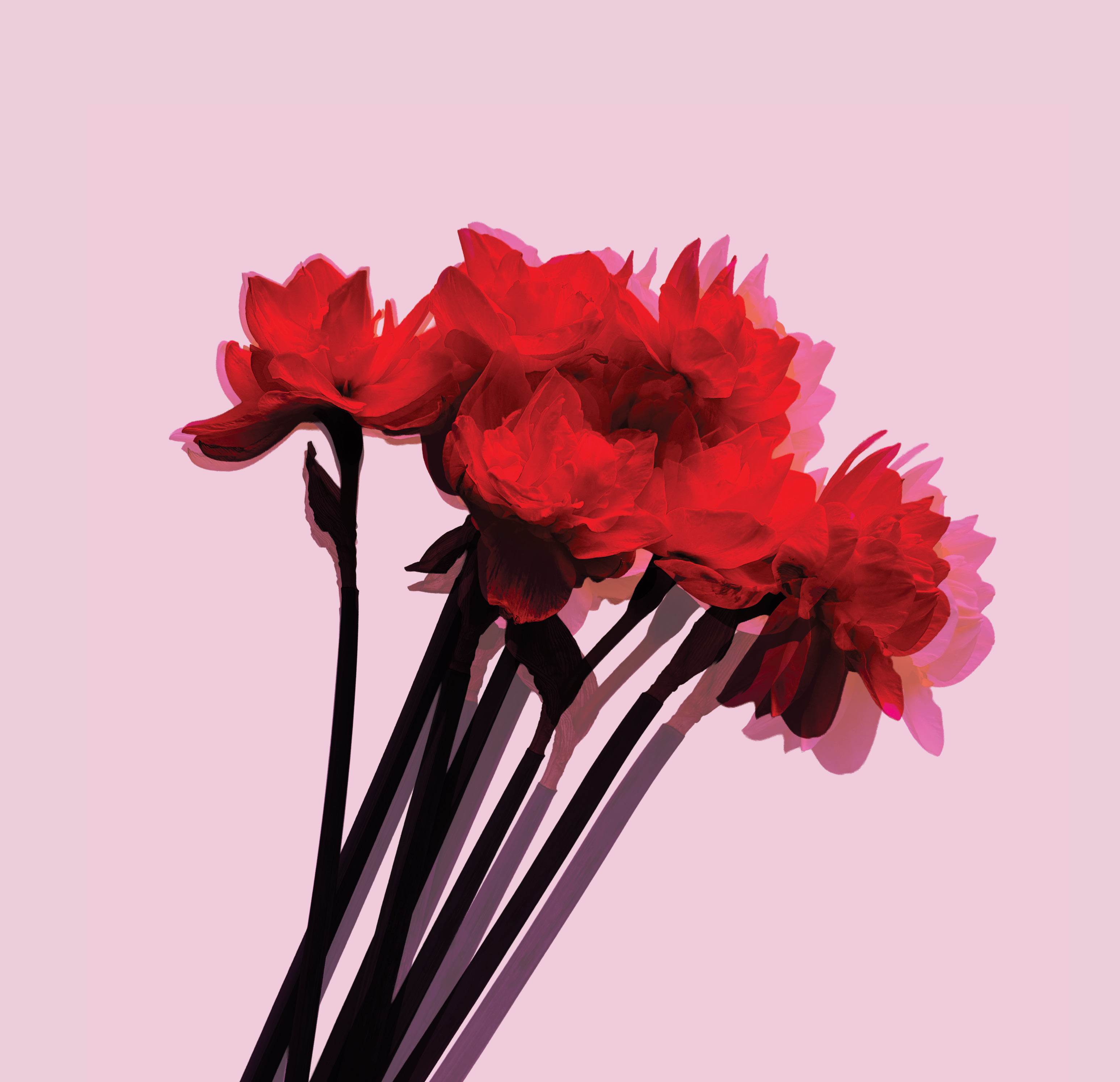
Authentic Selves — 'The Performance' (Illustrator) and 'Reflection' (Photoshop composite)
"Authenticity is not something we achieve once and for all. It is something we practice, repeatedly, in a world that is always watching."
Each article gets its own visual world.
Rather than applying a single aesthetic across the magazine, I gave each article its own colour palette and visual language — while keeping them connected through conceptual imagery. Every visual element was chosen because it meant something in relation to the text it accompanied.
The Authentic Selves article — on Goffman, Narcissus, and Hamlet as lenses for identity in the social media age — is illustrated with two original artworks. The Performance is a digital illustration sketched in Procreate and finalised in Illustrator: a crowned figure whose reflection is a skull — placing the reader simultaneously inside Goffman's theory of performance, the myth of Narcissus, and Hamlet. Reflection is a Photoshop composite using narcissus flowers, colour-altered and mirrored — influenced by Warhol's flower series and the idea that authenticity develops through influence rather than in spite of it.
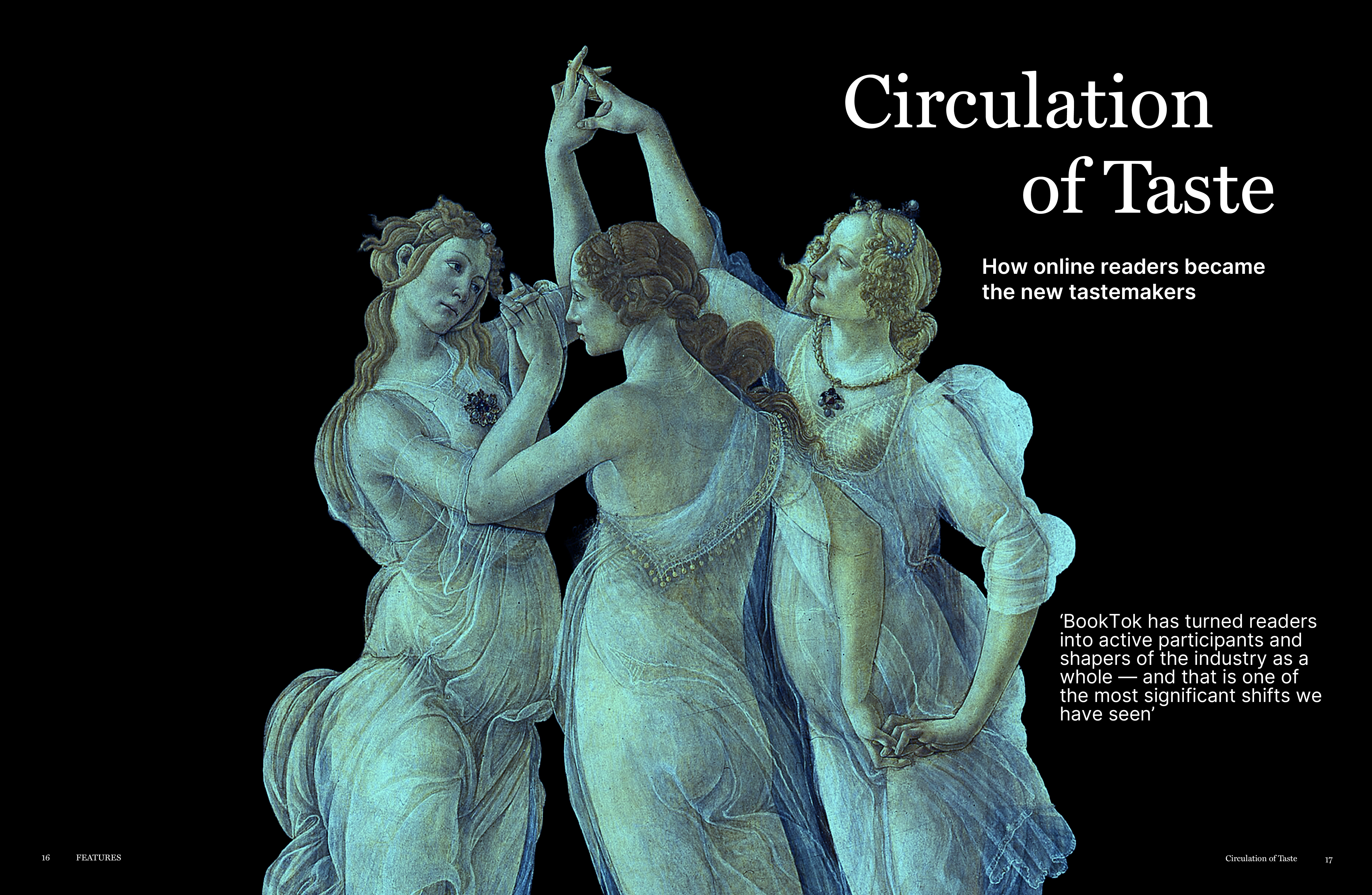
Circulation of Taste — Botticelli's Primavera (c.1477–82), the Three Graces as publisher, platform and reader
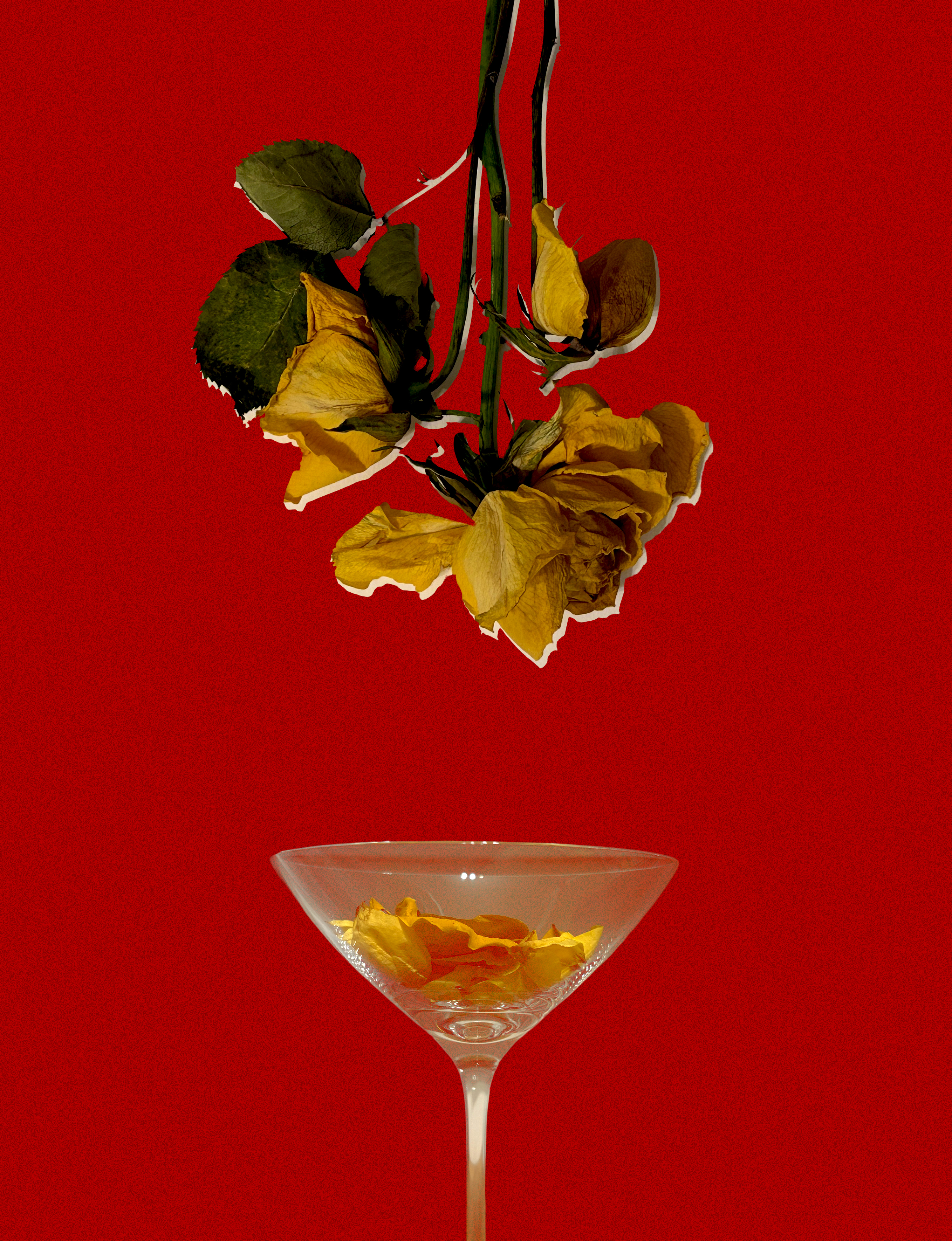
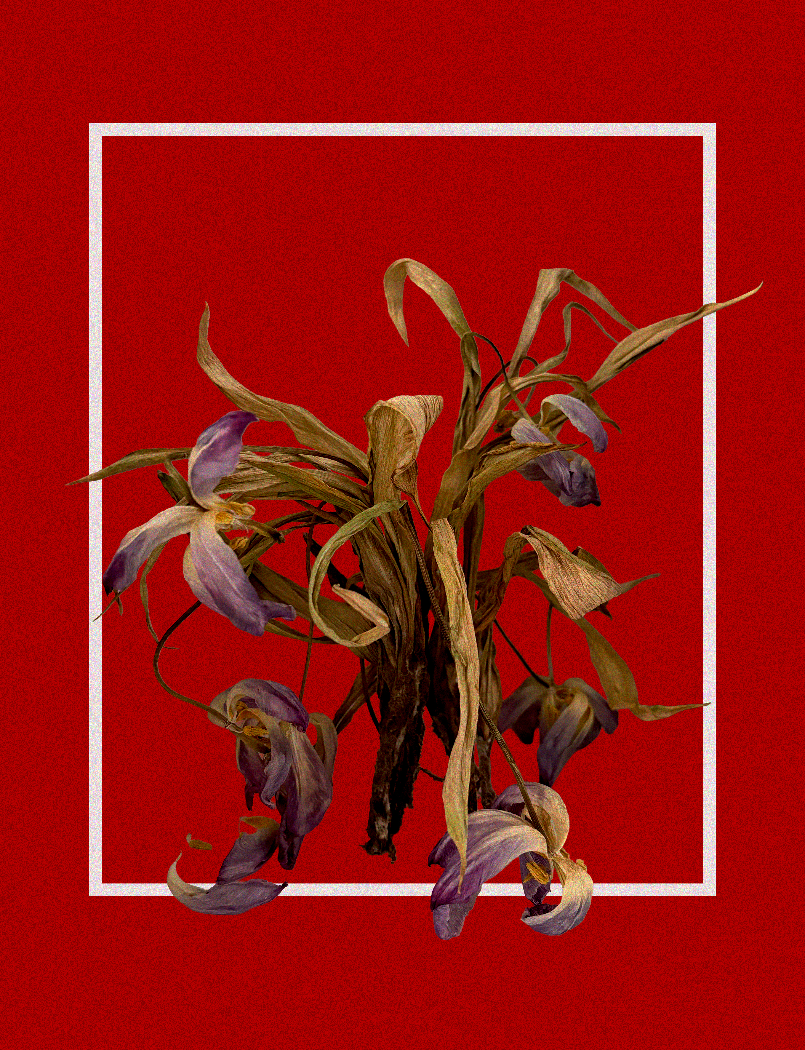
When Nostalgia Ages — 'After Last Call' and 'What Remains', original photographic composites
Process
The process started with the editorial questions, not the visual form. I conducted four original interviews — with Amy Waite (BookTok and literary gatekeeping), Dr Hannah Hamad (nostalgia on screen), Dr Deborah Jermyn (Sex and the City and And Just Like That), and David Kimpton (expressive heritage branding) — and wrote all five articles from the transcripts before a single spread was designed.
The cover came last. The Winged Victory of Samothrace — headless, faceless, defined entirely by forward momentum — was chosen for its symbolic weight, not its visual drama. Every image in CULTŪRA was selected because it meant something in relation to the text it accompanied. The Ophelia suspended between control and surrender, the Three Graces mapping the forces that shape what we read, the narcissus flowers that dissolve the boundary between natural and constructed — none of these are decorations. They are arguments.
The goal was for the visual and editorial layers to intersect rather than illustrate each other — for the images to carry meaning that the writing couldn't, and vice versa. A reader who only looks at the spreads should feel something. A reader who only reads the articles should feel something different. Together, they should feel more than the sum of both.
One spread works as a typographic argument in itself: in the From Helvetica to Heritage article on expressive branding, HELVETICA is set in Didot and HERITAGE is set in Helvetica. The words say one thing; the typefaces say the opposite. A reader who notices the swap understands the article before reading a word of it.
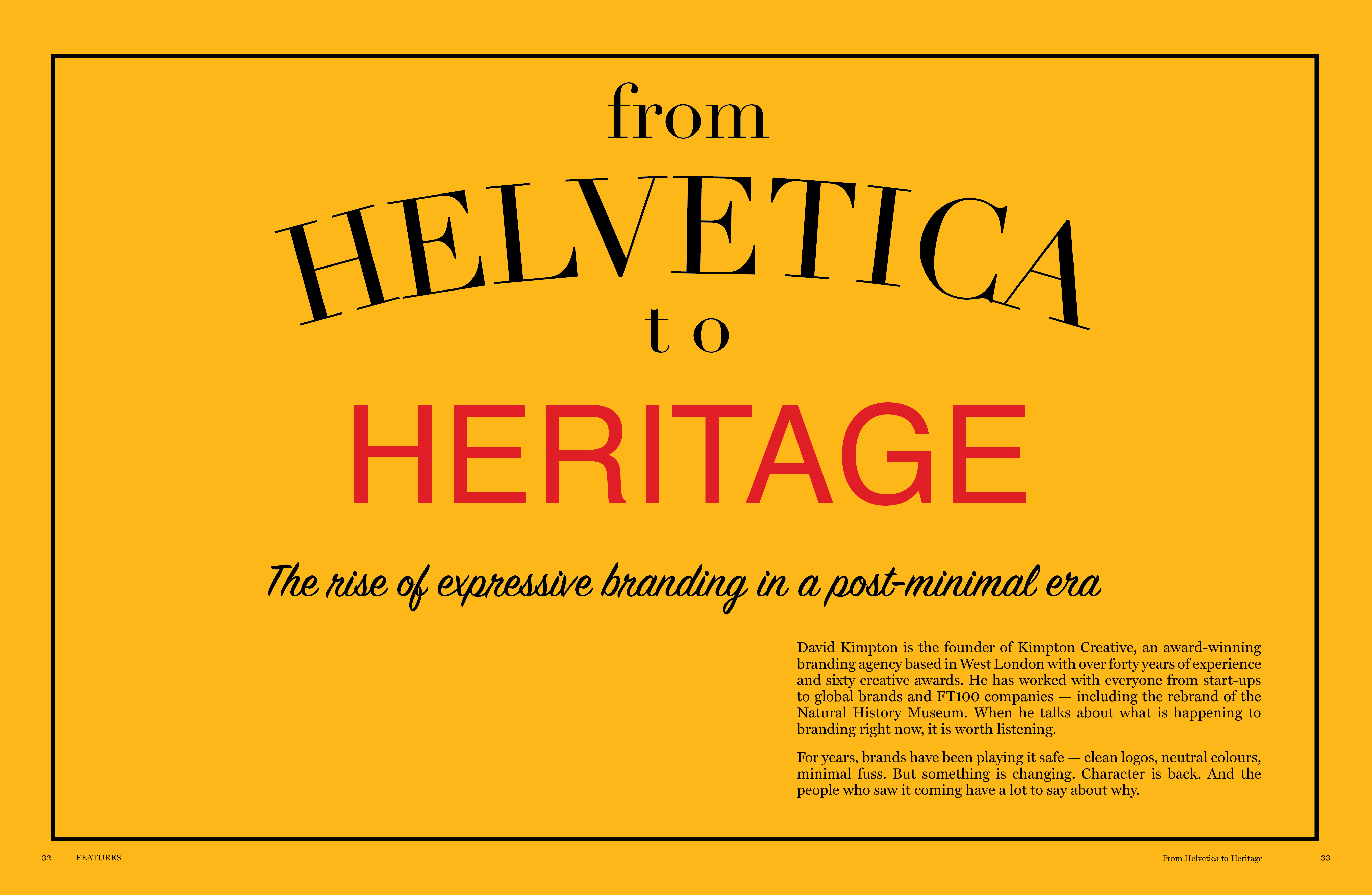
From Helvetica to Heritage — HELVETICA in Didot, HERITAGE in Helvetica
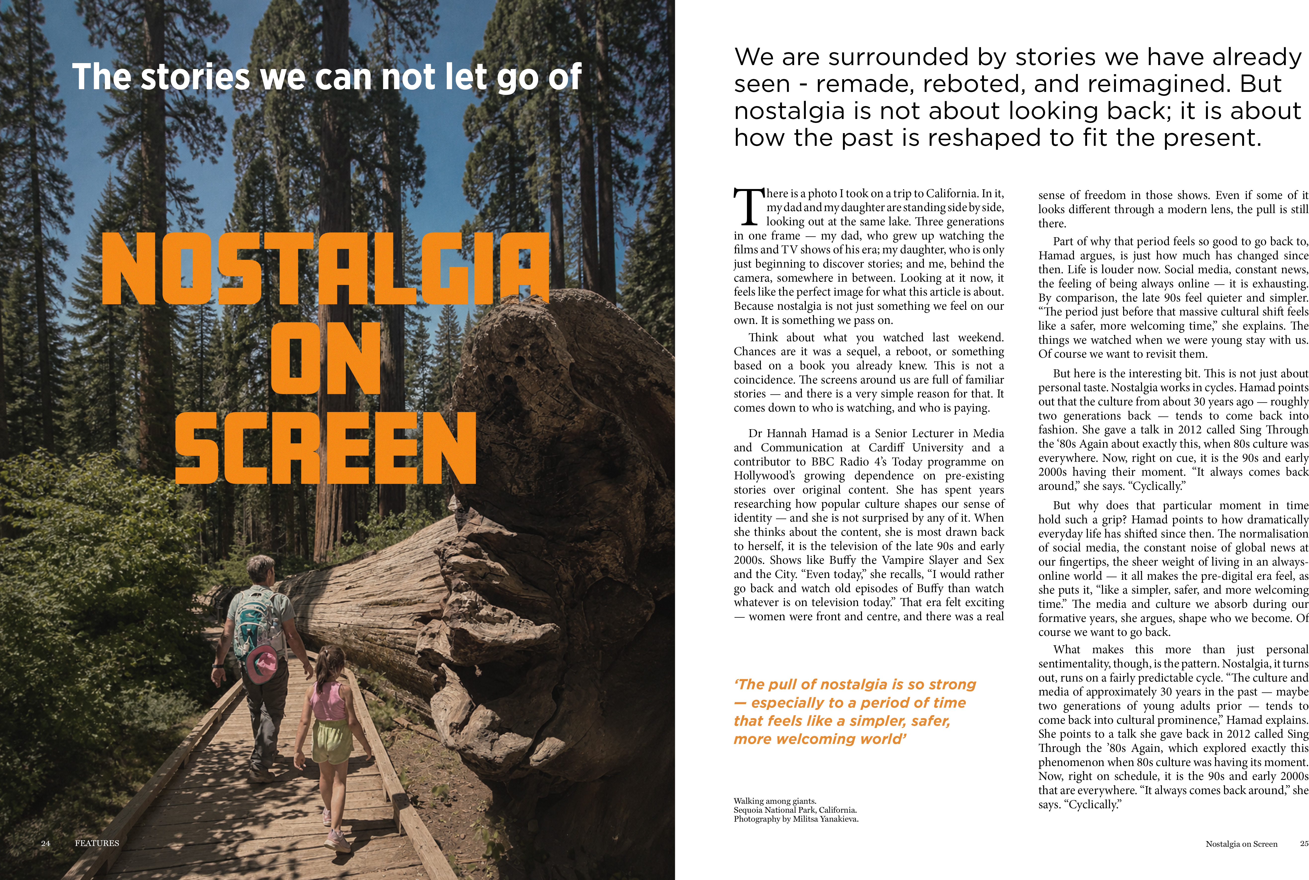
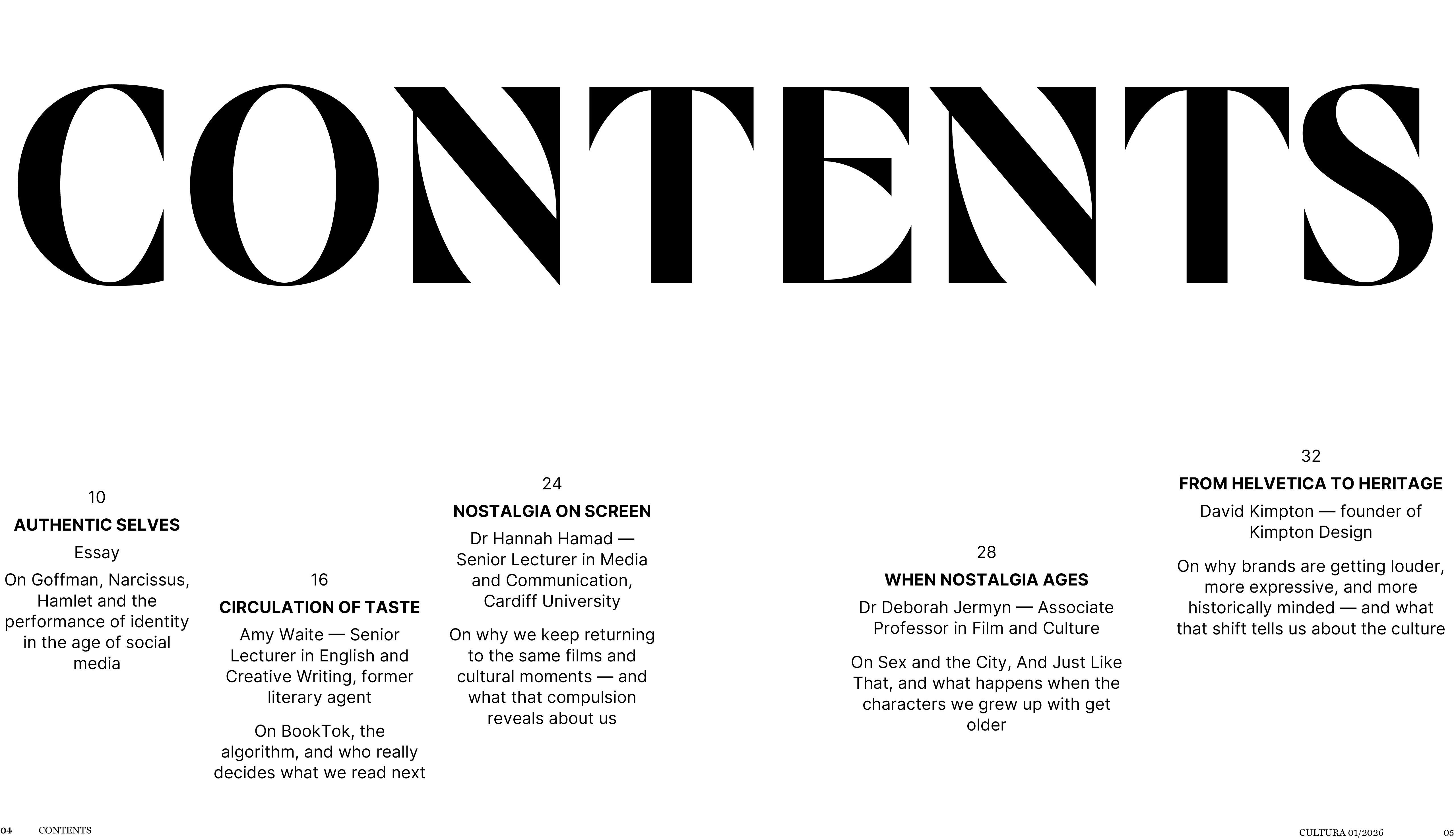
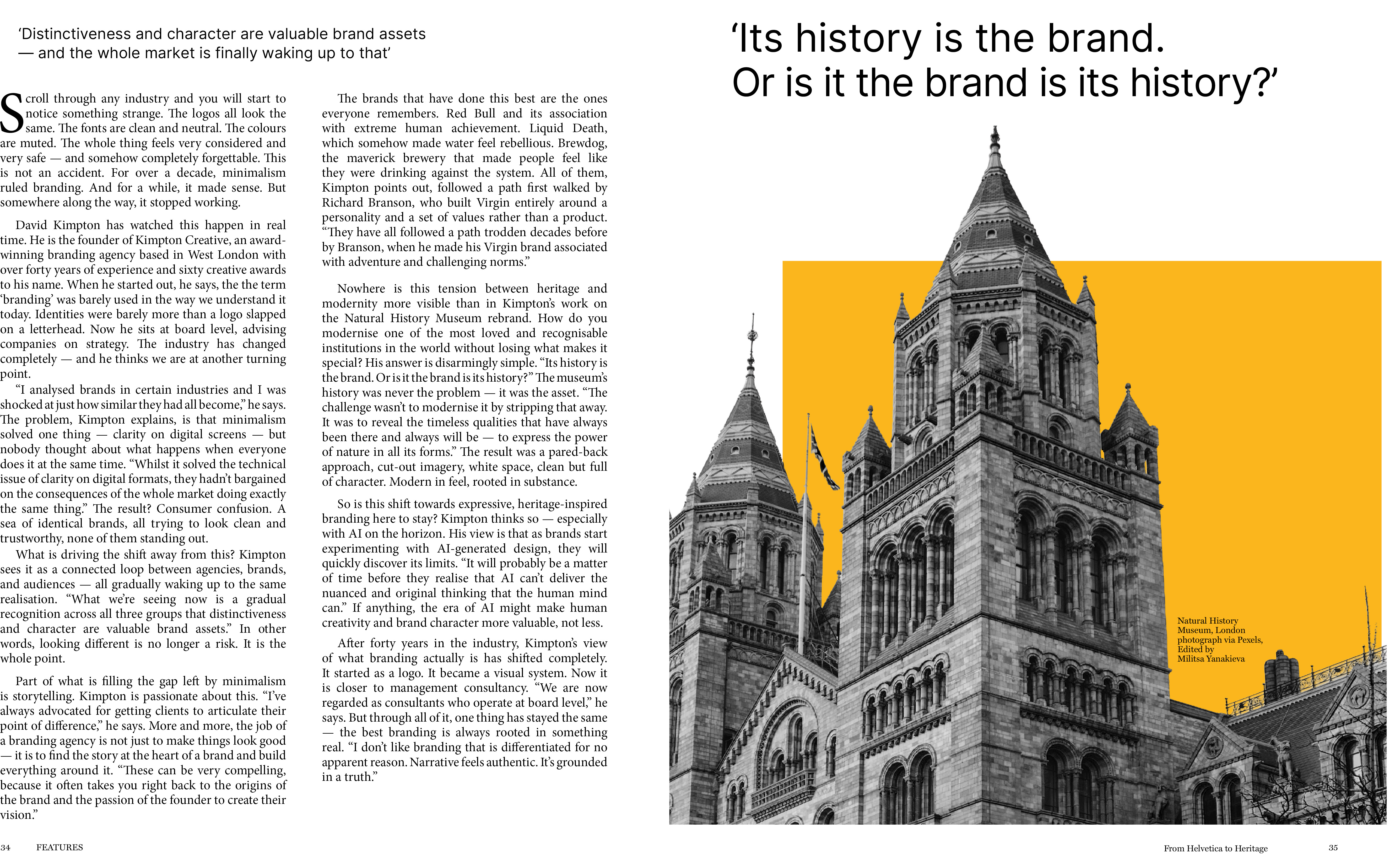
Interior spreads — typographic system across five features